Was bedeutet es, eine Währung zu gestalten?
Wenn man eine Währung als Kommunikationsmaßnahme eines Landes oder eines Bündnisses von Ländern betrachtet, ergeben sich daraus einige vielversprechende Gedankengänge. Eine Banknote repräsentiert die jeweilige Region, ihre Werte und Ideen. Gleichzeitig soll sie seriös und stark auftreten. Sie muss klar erkennbar sein, einen hohen Wiedererkennungswert besitzen und dennoch eigenständig wirken, dabei aber stets als Währung erkennbar bleiben und zuverlässig funktionieren. Wir betrachteten den Euro als Kommunikationsmedium der Europäischen Union. Ein Medium, das täglich mehr als 100 Millionen Mal verwendet und noch um ein Vielfaches häufiger gesehen wird.
From over 1,200 applications across Europe, 25 designers and agencies were invited to develop design proposals for future euro banknotes. Our entry was selected by an international jury as one of the ten finalists and is part of the European Central Bank's public consultation.
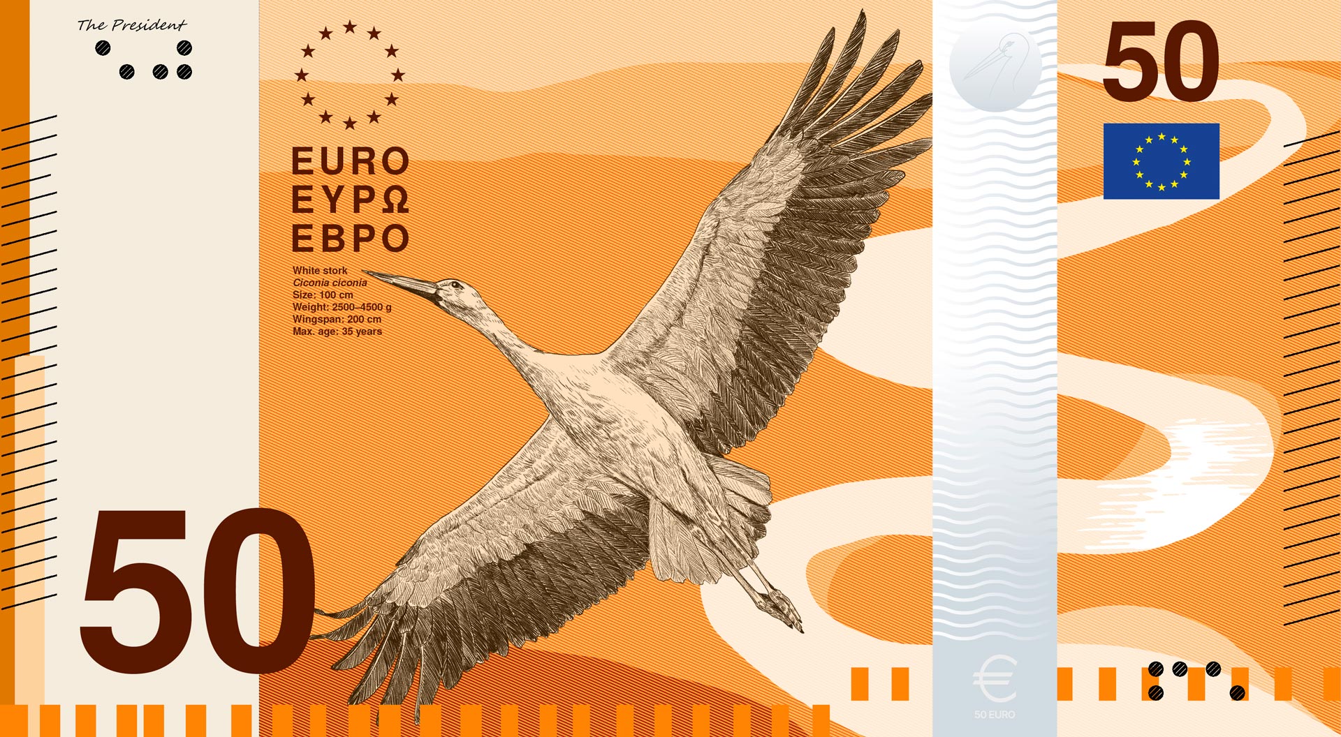
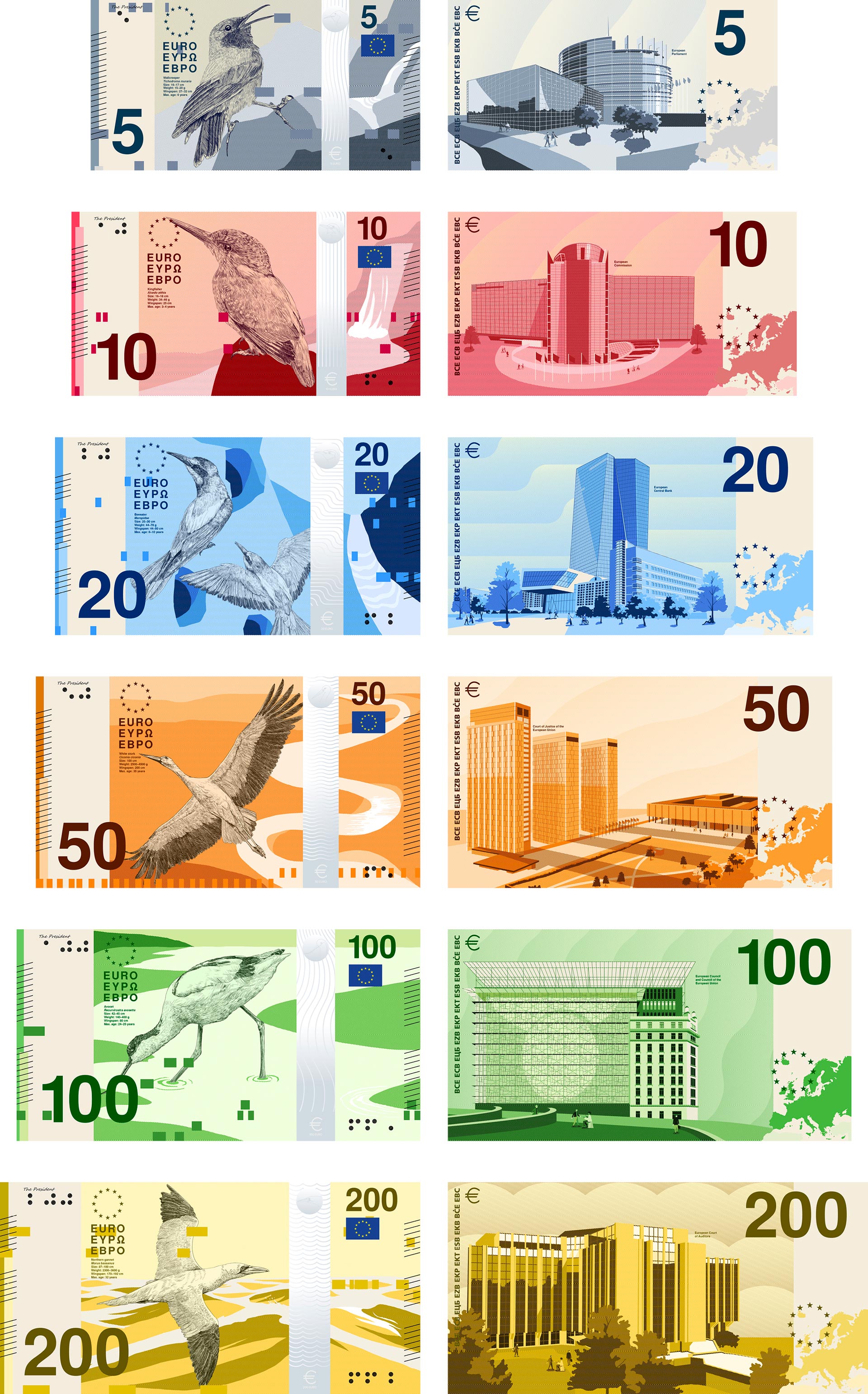
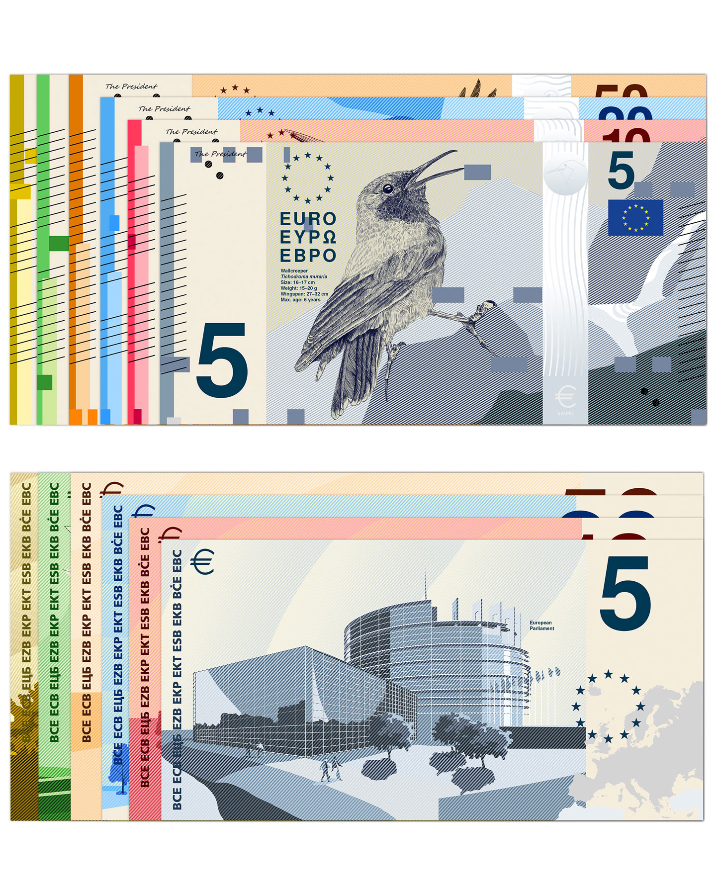
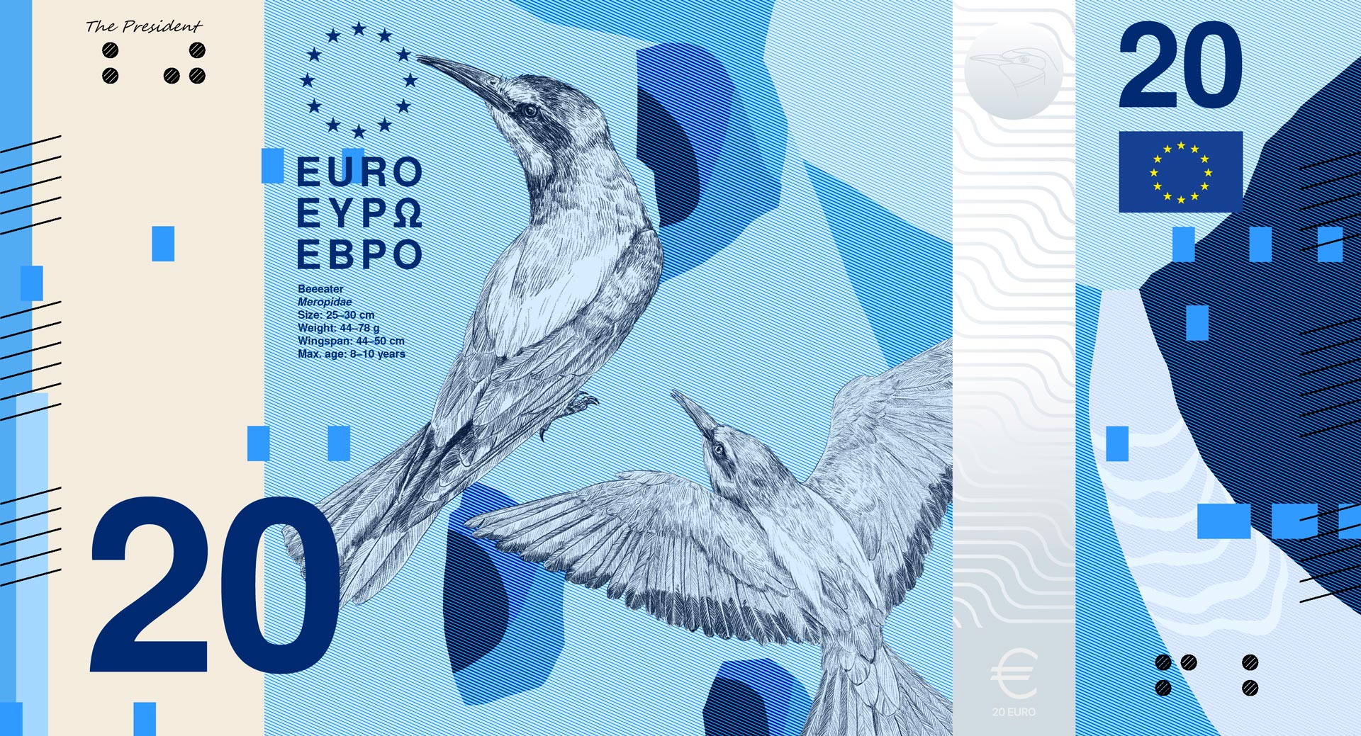
The goal was to create a banknote series that feels contemporary without compromising the seriousness and trustworthiness of a currency. The design combines emotional aesthetics with analytical precision, translating the theme “Rivers and Birds” into a visual system that conveys information and aesthetics in equal measure.
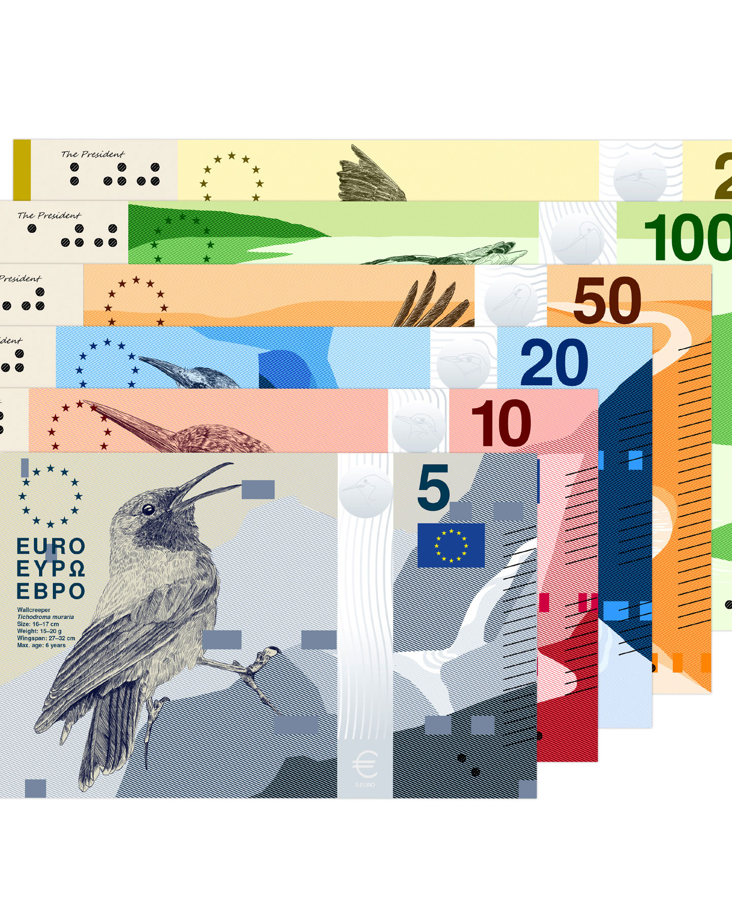
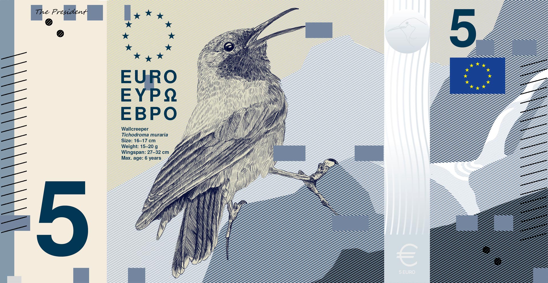
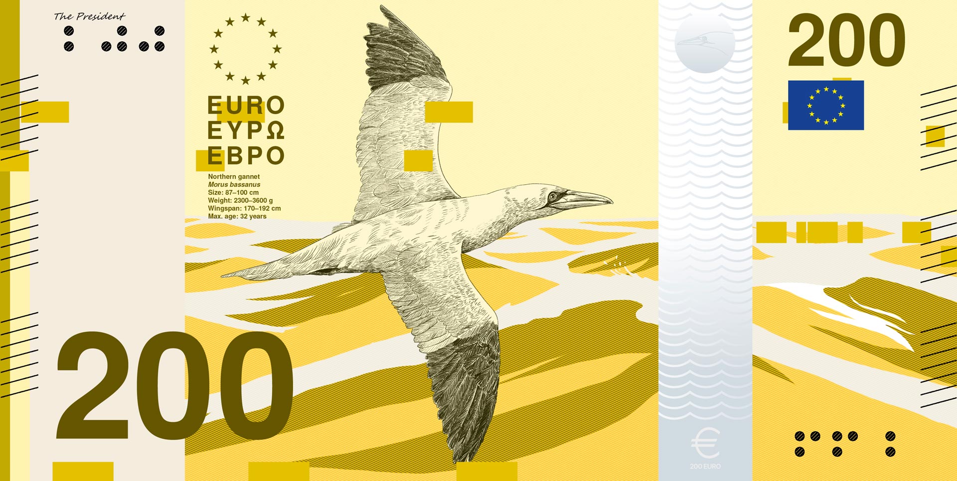
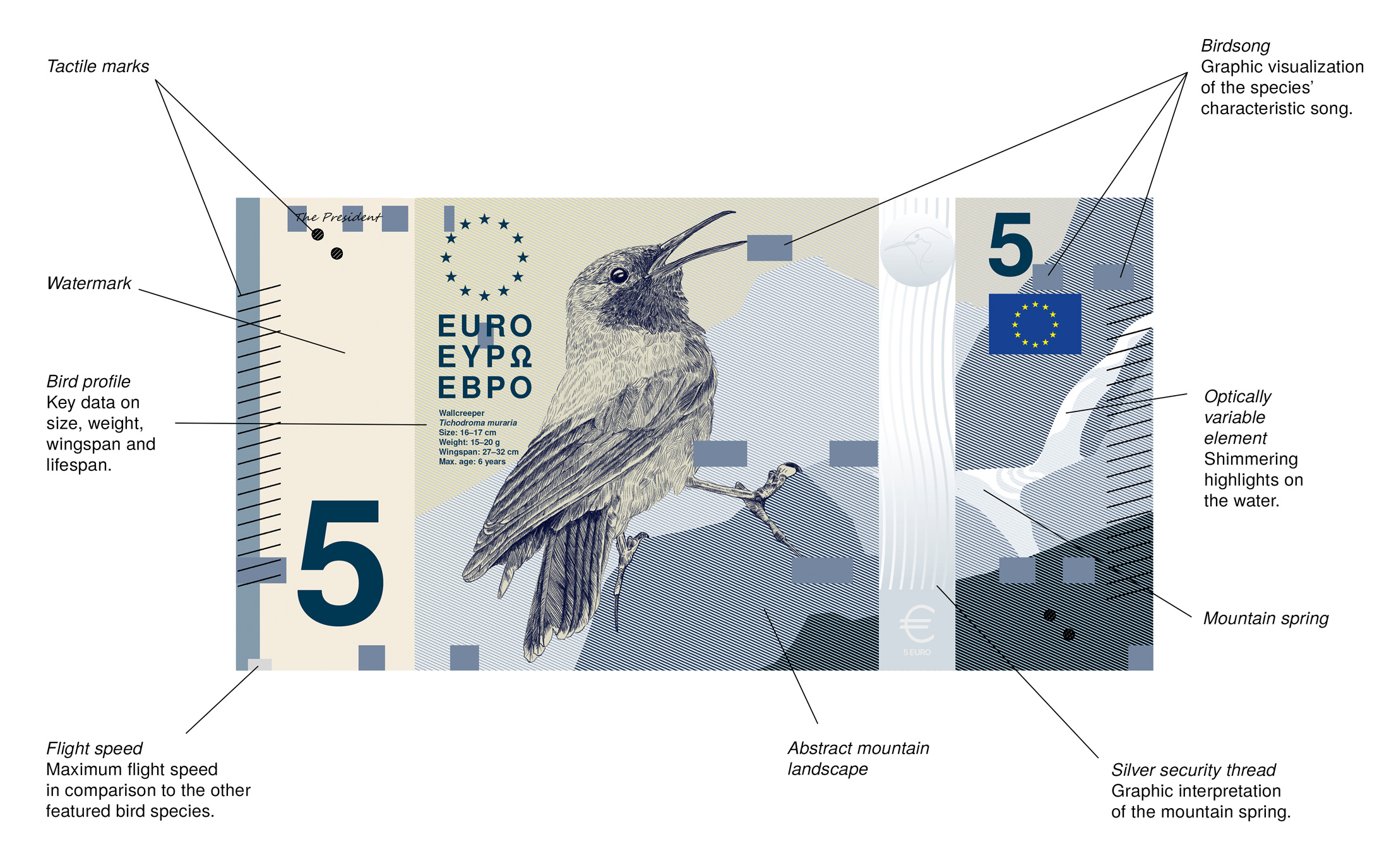
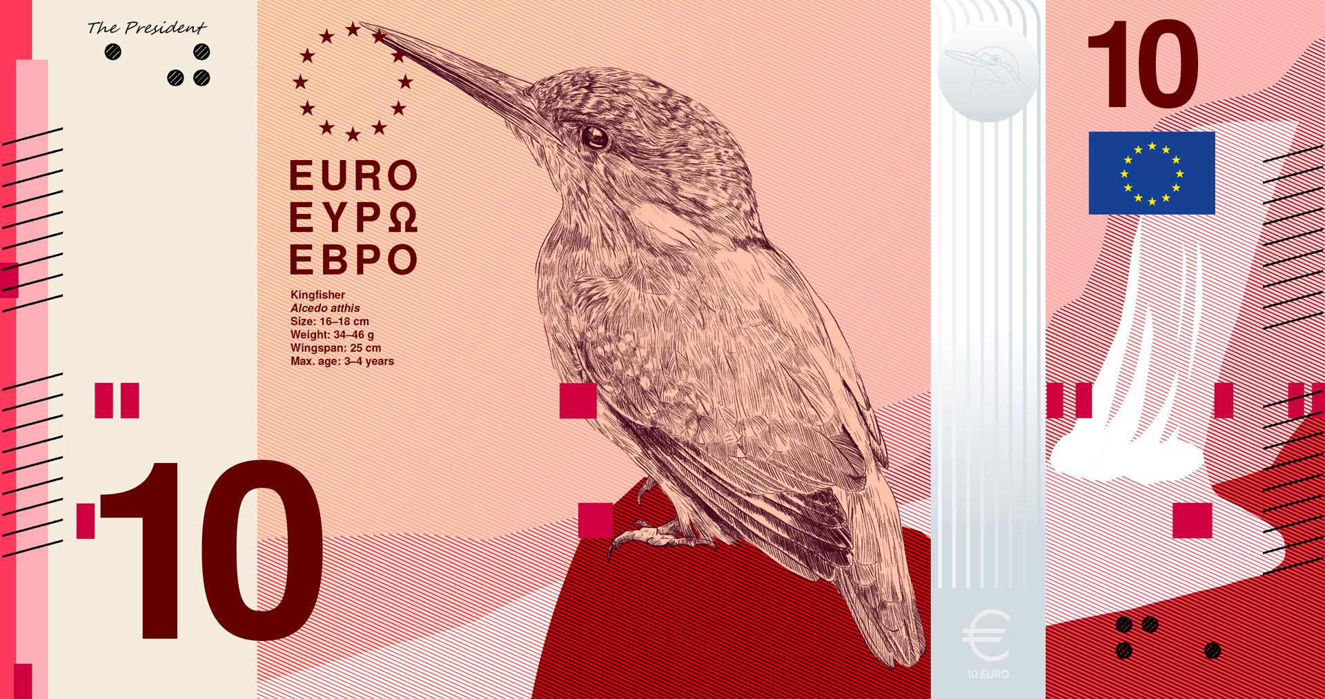
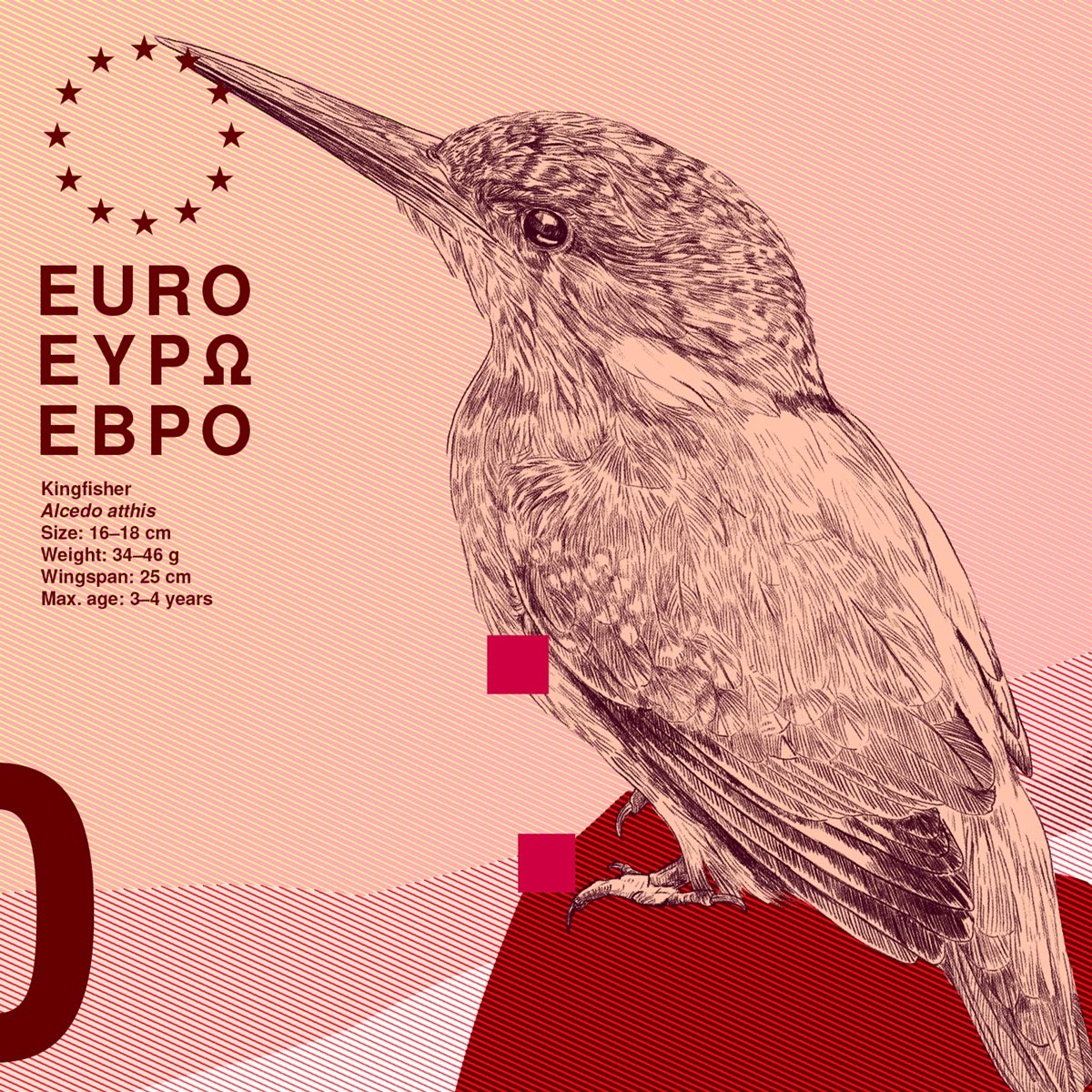
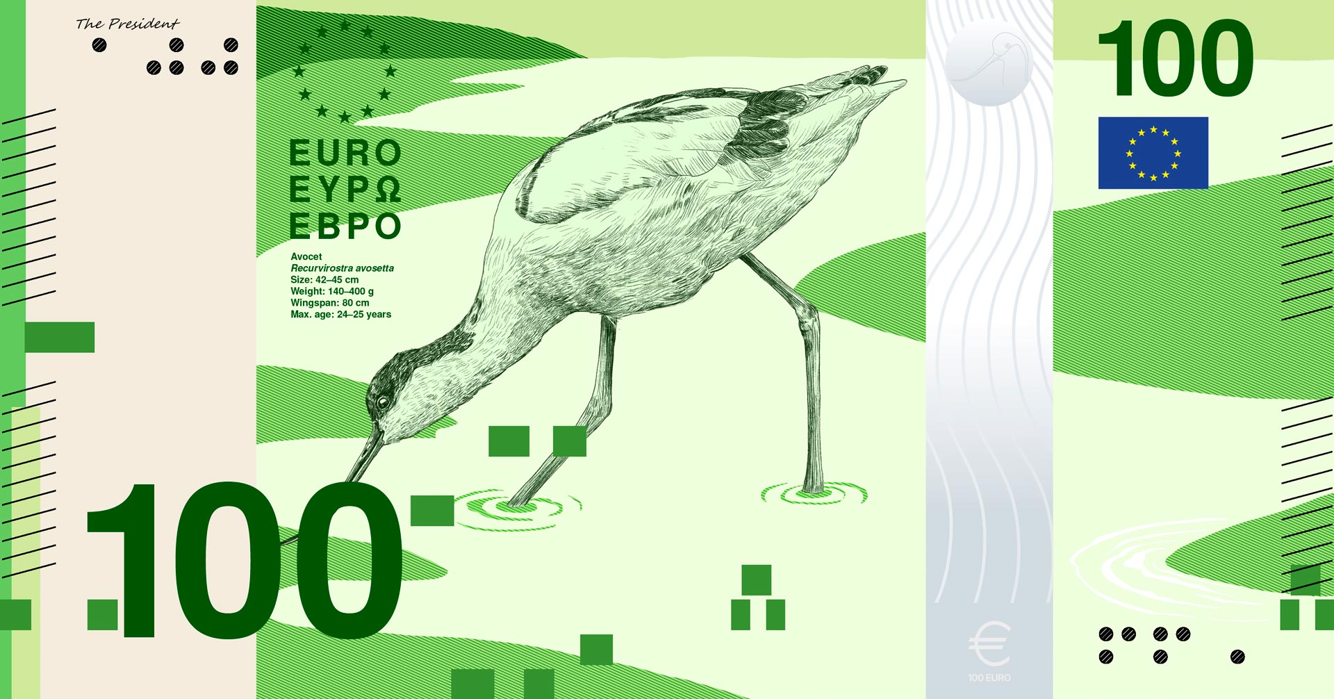
The obverse sides feature Europe’s waterways and their characteristic bird species using a deliberately minimalist visual language. The landscapes are abstracted, making the bird the central element of each composition. The illustrations are inspired by the classic copperplate engravings of historical banknotes, blending traditional value with modern design.
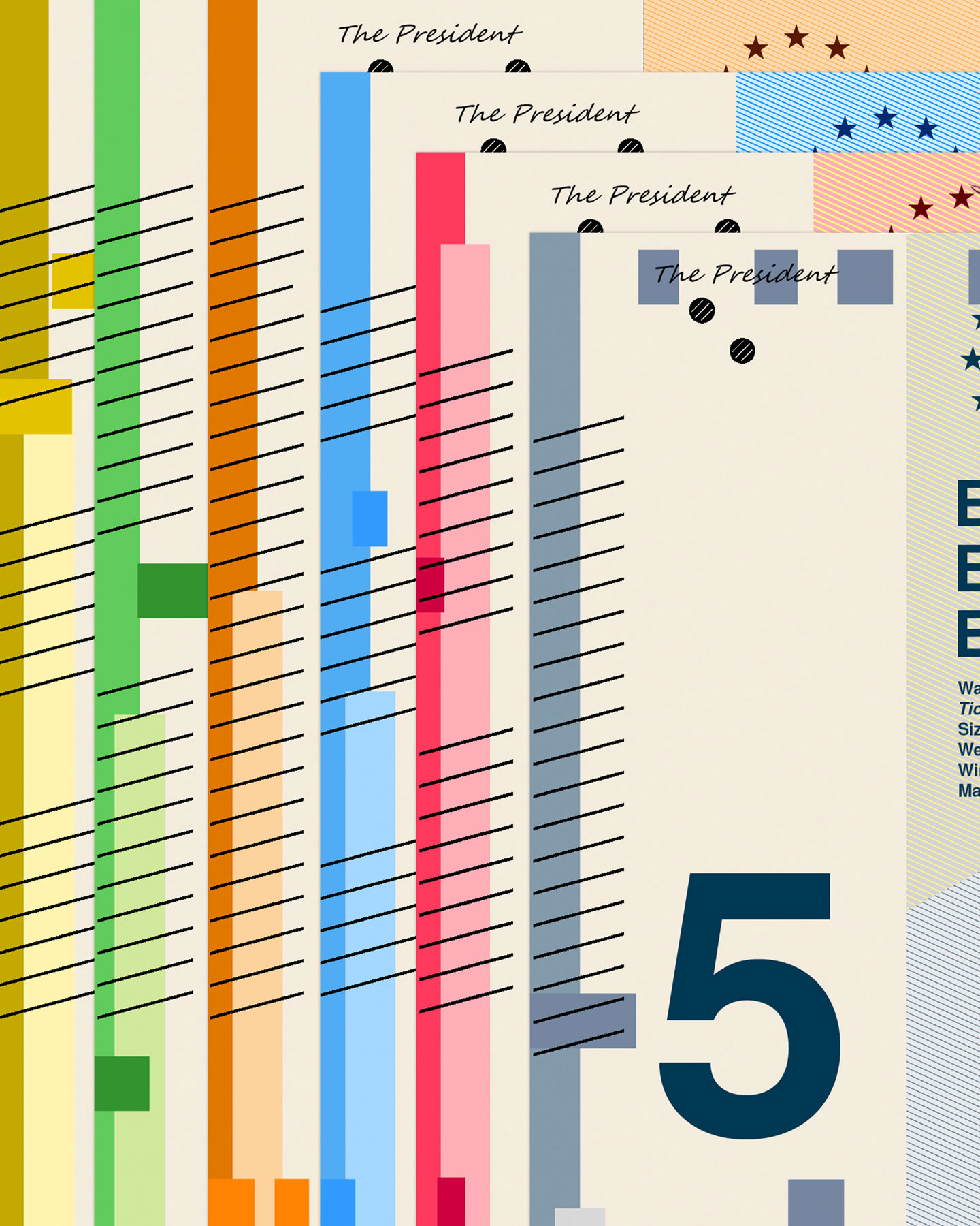
Every graphic element serves a specific function. The birds' calls are visualized as a graphic sound wave based on MIDI notes, complemented by a concise species profile. A vertical scale makes the flight speed of each species comparable across the entire series, creating an additional layer of information that underscores the analytical nature of the design.
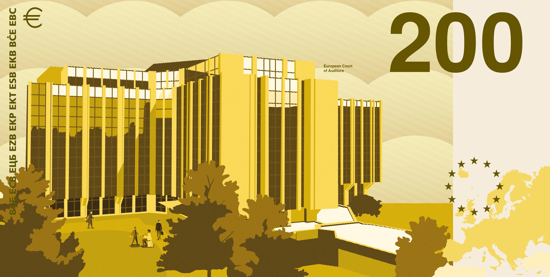
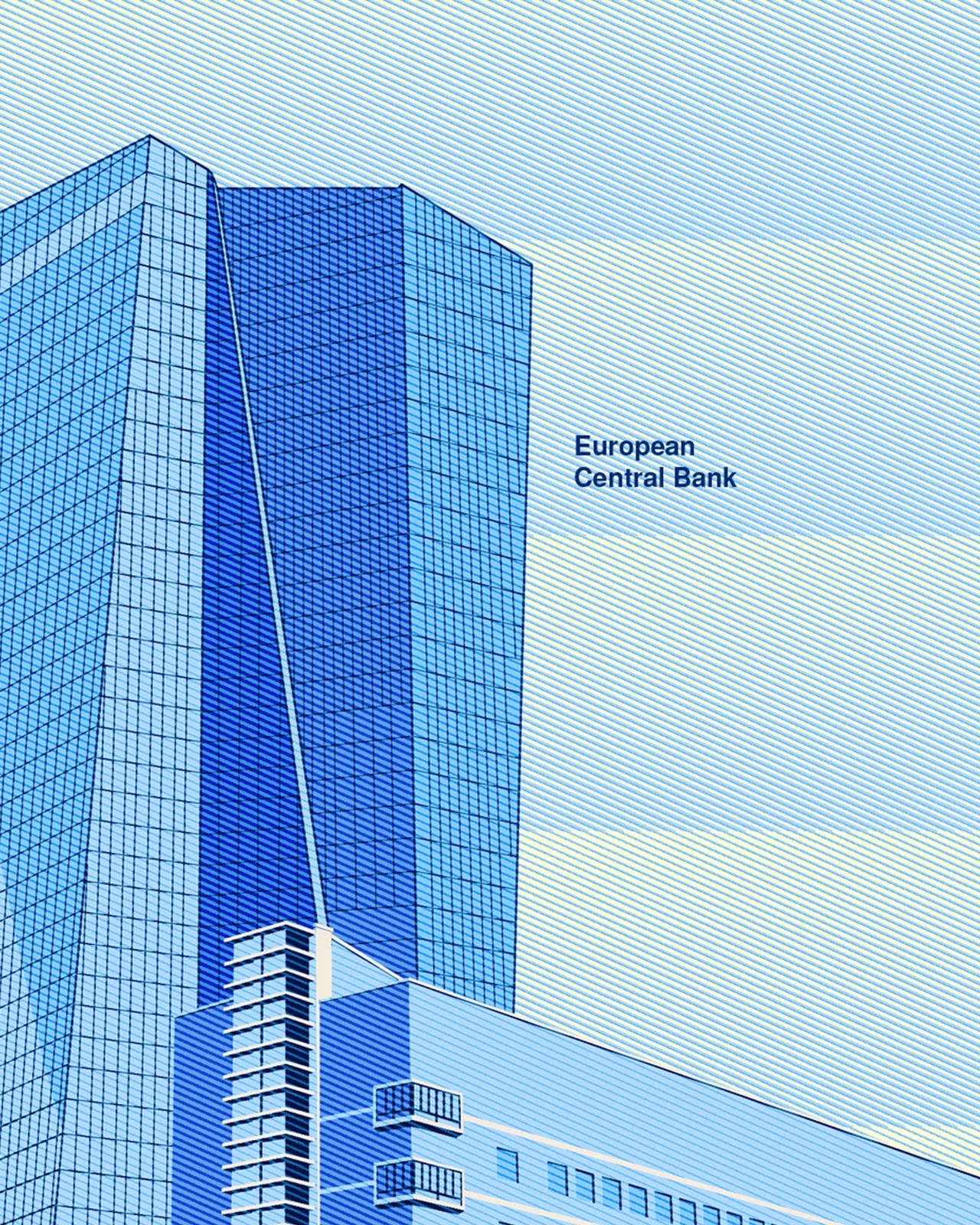
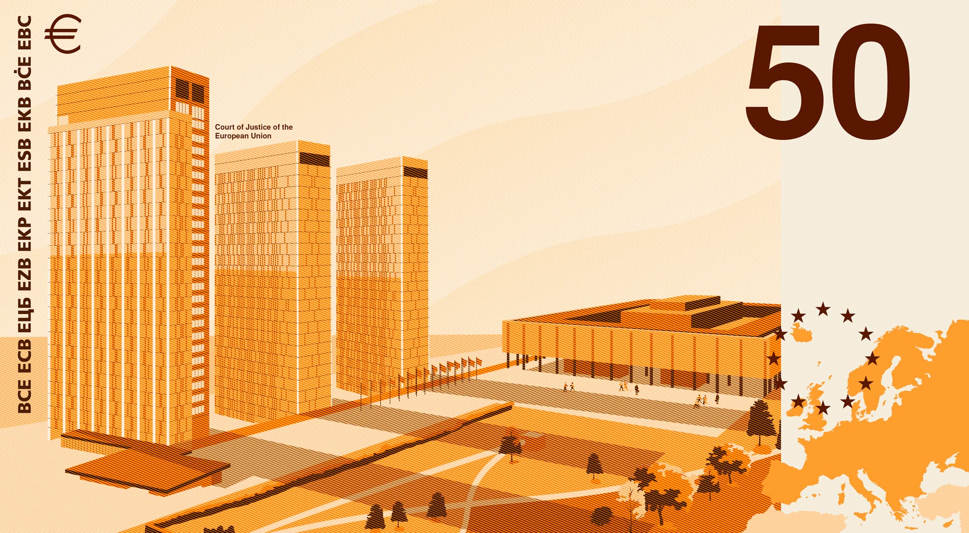
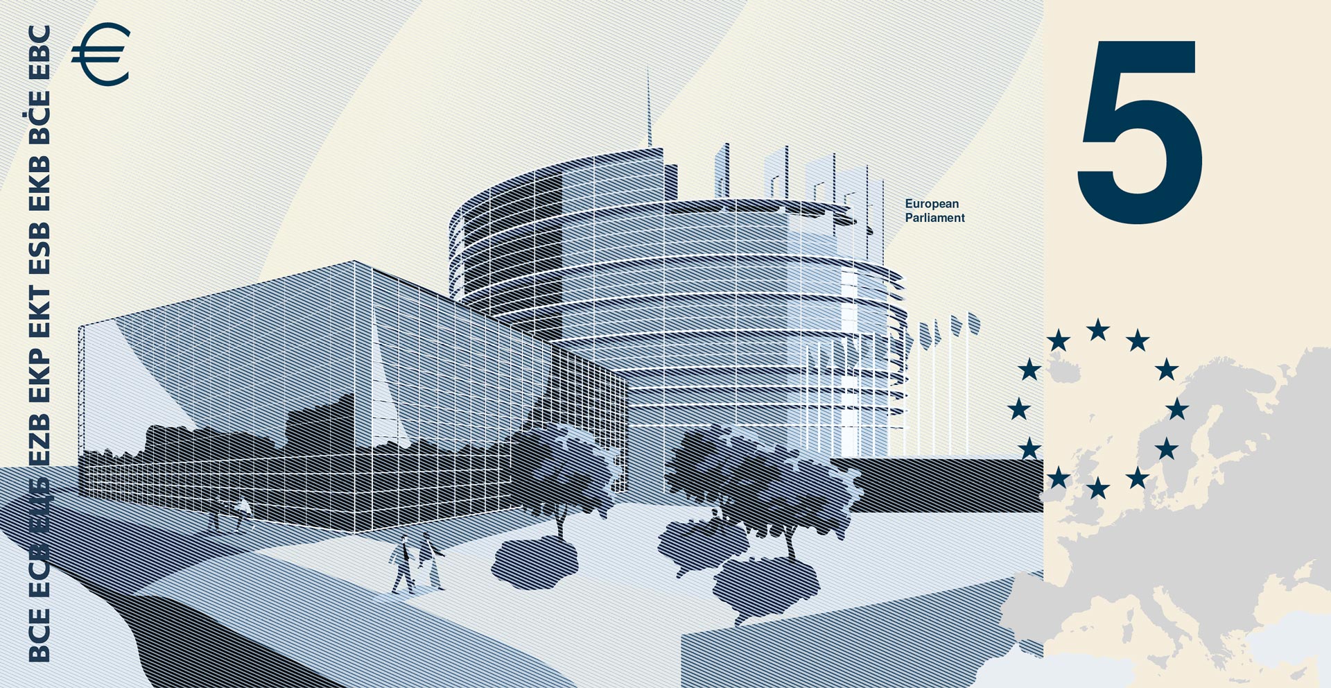
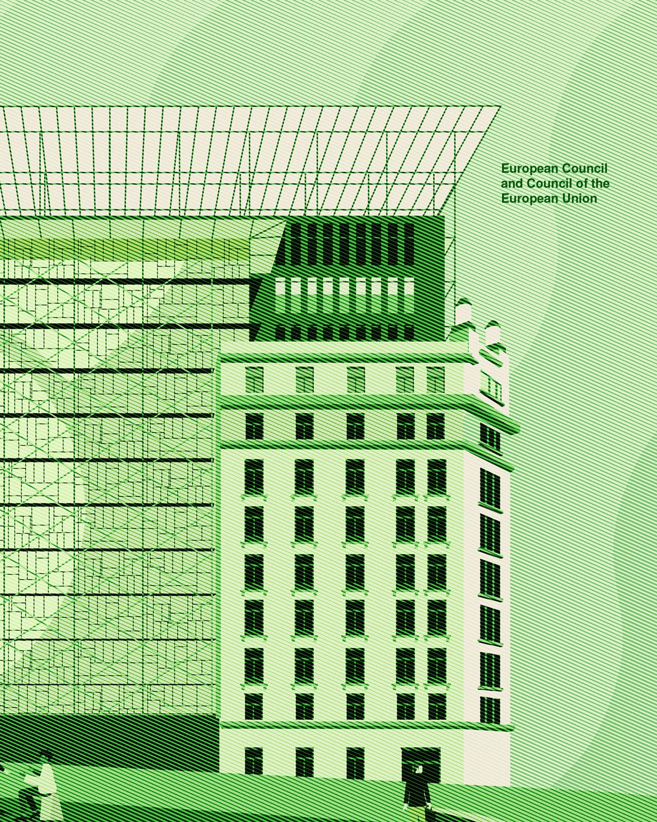
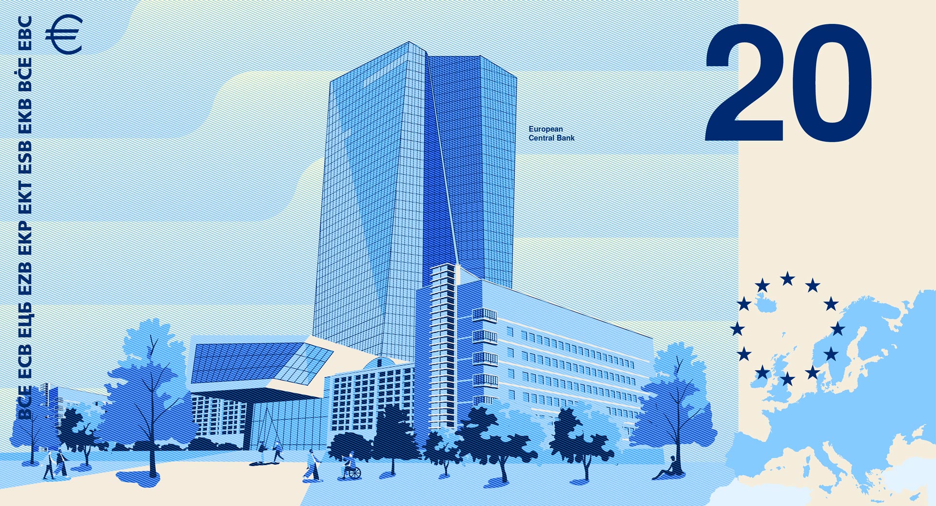
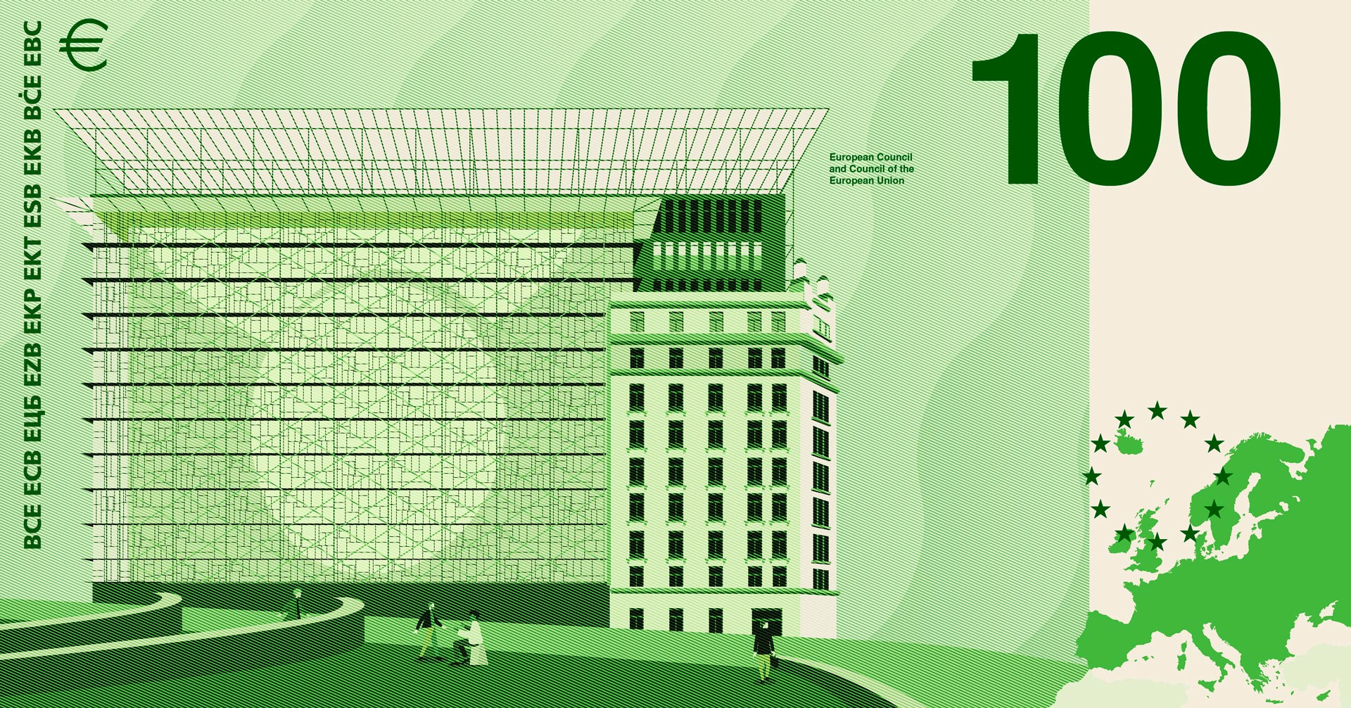
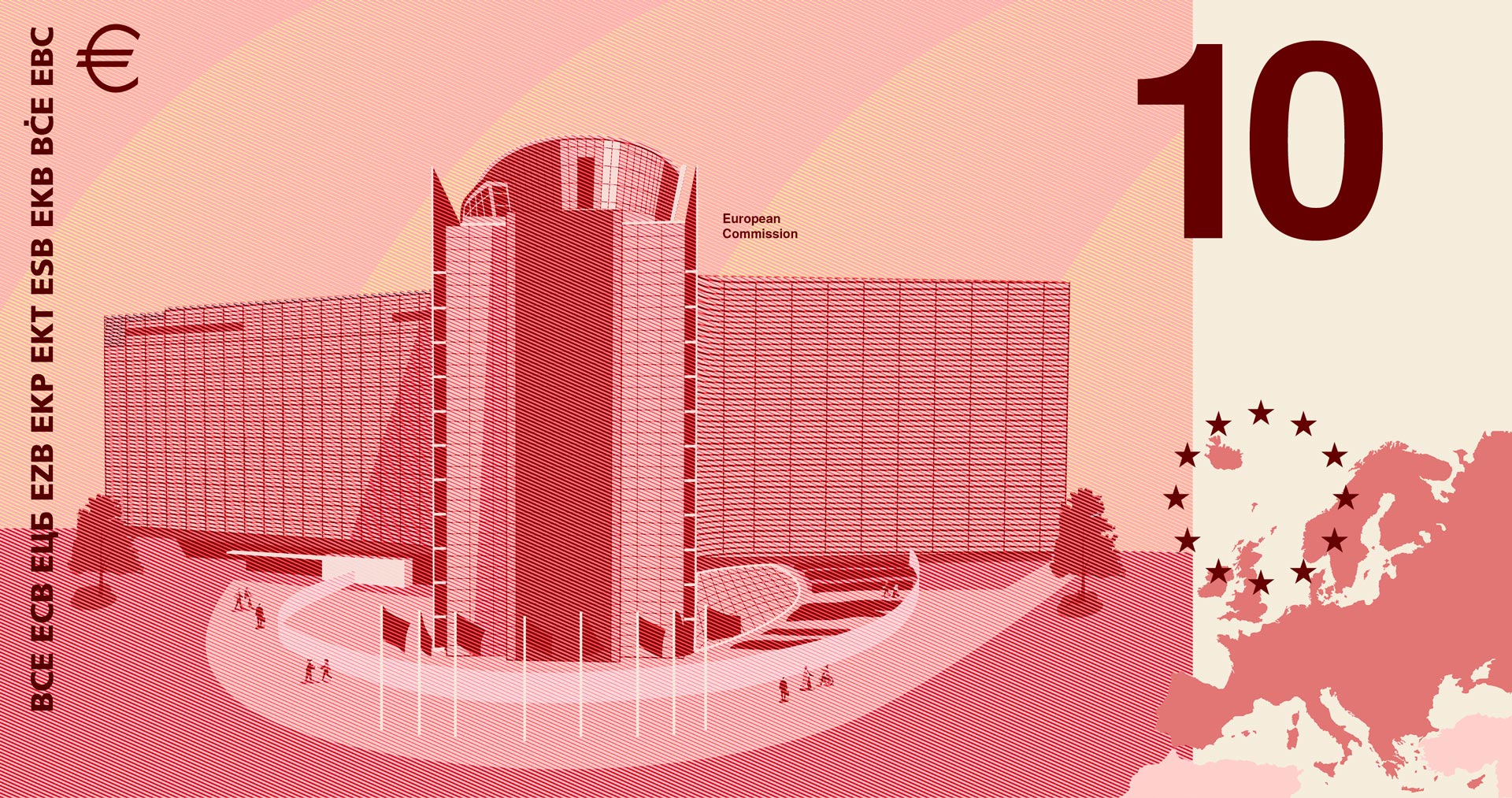
The reverse sides interpret architectural motifs through a clear, modern design language. Together with the map of Europe, they bridge the gap between nature, culture, and a shared European identity. The sky reflects the type of waterway from the obverse, connecting both sides of each banknote into a consistent visual system.
The design views the banknote not just as a means of payment, but as an everyday medium that combines information, orientation, and identity.
Take the survey:
https://surveys.ecb.europa.eu/10b/neweuro/

From over 1,200 applications across Europe, 25 designers and agencies were invited to develop design proposals for future euro banknotes. Our entry was selected by an international jury as one of the ten finalists and is part of the European Central Bank's public consultation.
The goal was to create a banknote series that feels contemporary without compromising the seriousness and trustworthiness of a currency. The design combines emotional aesthetics with analytical precision, translating the theme “Rivers and Birds” into a visual system that conveys information and aesthetics in equal measure.
The obverse sides feature Europe’s waterways and their characteristic bird species using a deliberately minimalist visual language. The landscapes are abstracted, making the bird the central element of each composition. The illustrations are inspired by the classic copperplate engravings of historical banknotes, blending traditional value with modern design.
Every graphic element serves a specific function. The birds' calls are visualized as a graphic sound wave based on MIDI notes, complemented by a concise species profile. A vertical scale makes the flight speed of each species comparable across the entire series, creating an additional layer of information that underscores the analytical nature of the design.
The reverse sides interpret architectural motifs through a clear, modern design language. Together with the map of Europe, they bridge the gap between nature, culture, and a shared European identity. The sky reflects the type of waterway from the obverse, connecting both sides of each banknote into a consistent visual system.
The design views the banknote not just as a means of payment, but as an everyday medium that combines information, orientation, and identity.
Take the survey:
https://surveys.ecb.europa.eu/10b/neweuro/
(3) Grafisch visualisierter Vogelgesang.
(1)
(4)