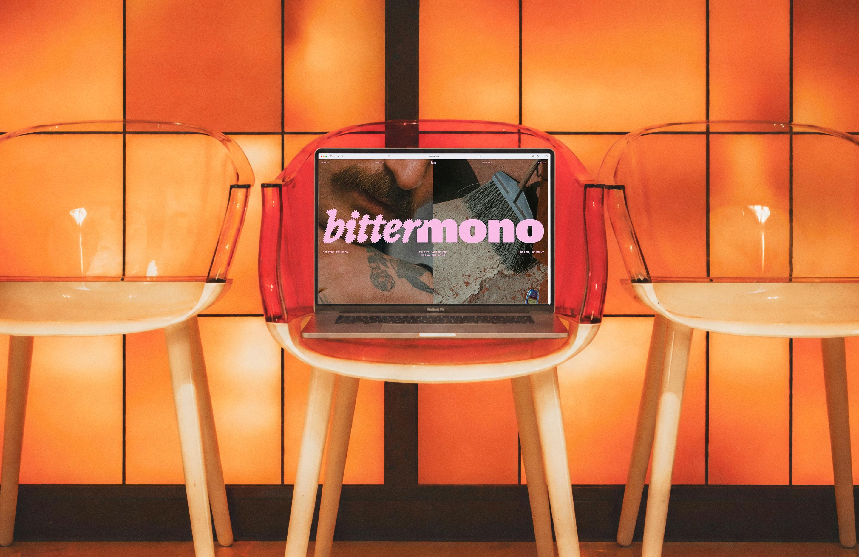
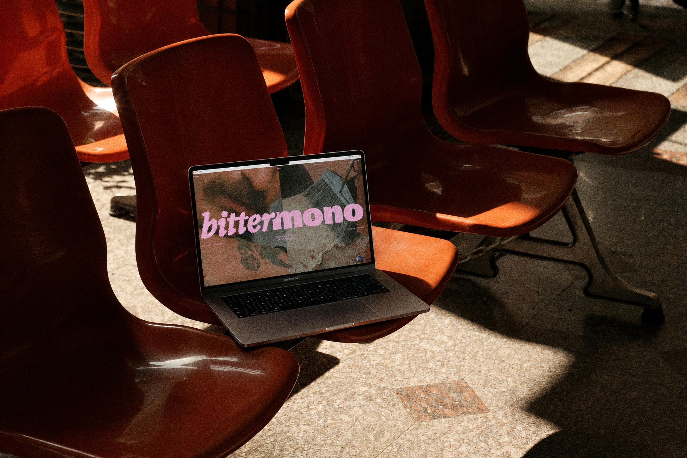
For bittermono we developed the corporate design and website for an agency that is reimagining talent management and brand building. The focus was on creating a visual identity that reflects the brand's ethos: clear, minimalist, and approachable. The design translates Bittermono’s commitment to forging genuine connections between talents and brands into a precise visual language.
The identity is built on a deliberate tension between clarity and character. Minimalist typography, generous white space, and a restrained design system create room for content and personality. At the same time, the striking imagery gives the brand a distinct presence that feels modern, thoughtful, and authentic—perfectly aligned with the positioning of both the agency and its talents.
For the website, we created a digital experience that blends editorial aesthetics with intuitive navigation. The minimalist structure directs focus toward content, personalities, and brand values, while subtle interactions and a clear visual hierarchy lend the site a sense of lightness and precision. The result is a brand identity that doesn't need to be loud to make a statement.
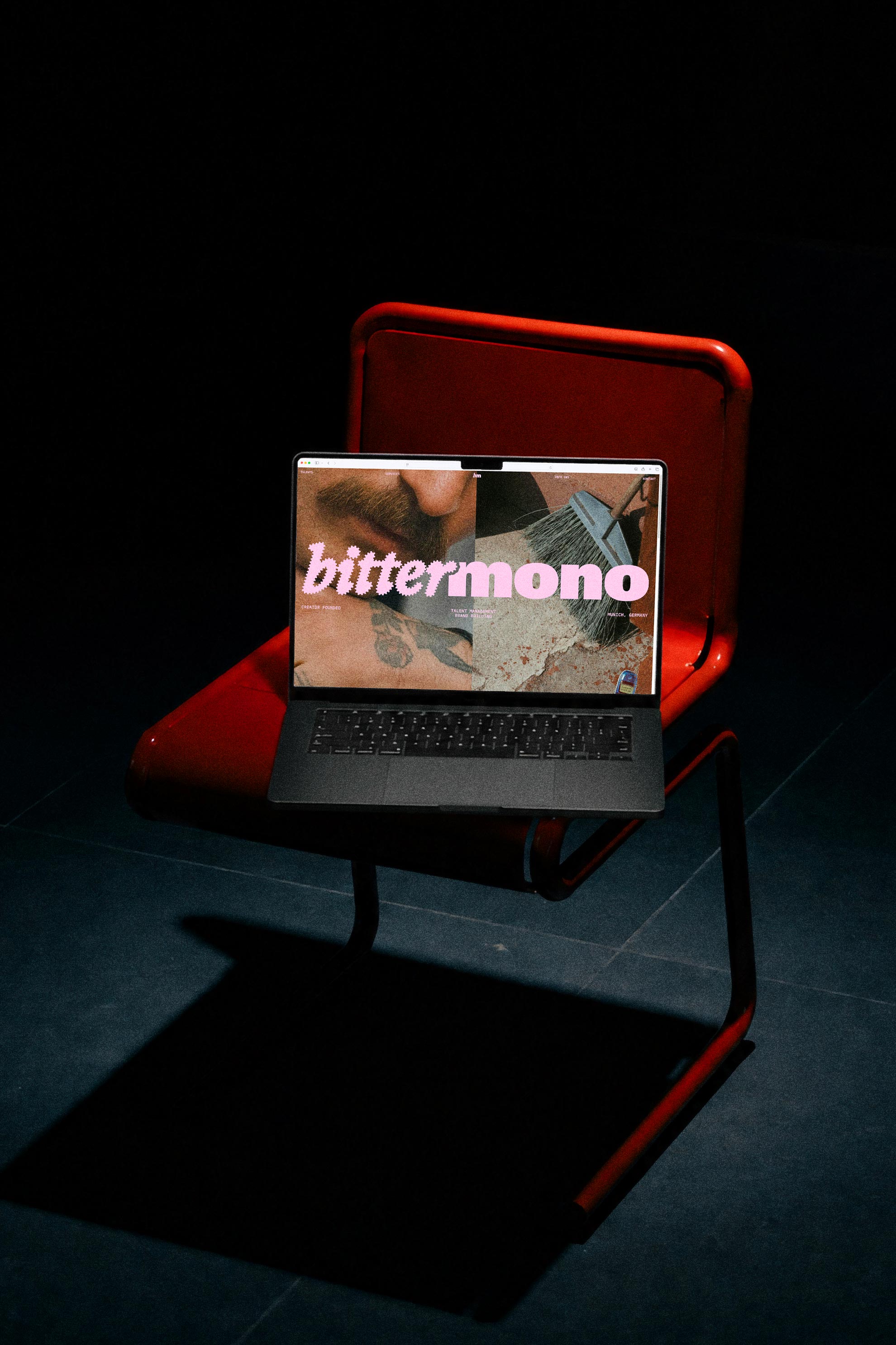
For bittermono we developed the corporate design and website for an agency that is reimagining talent management and brand building. The focus was on creating a visual identity that reflects the brand's ethos: clear, minimalist, and approachable. The design translates Bittermono’s commitment to forging genuine connections between talents and brands into a precise visual language.
The identity is built on a deliberate tension between clarity and character. Minimalist typography, generous white space, and a restrained design system create room for content and personality. At the same time, the striking imagery gives the brand a distinct presence that feels modern, thoughtful, and authentic—perfectly aligned with the positioning of both the agency and its talents.
For the website, we created a digital experience that blends editorial aesthetics with intuitive navigation. The minimalist structure directs focus toward content, personalities, and brand values, while subtle interactions and a clear visual hierarchy lend the site a sense of lightness and precision. The result is a brand identity that doesn't need to be loud to make a statement.