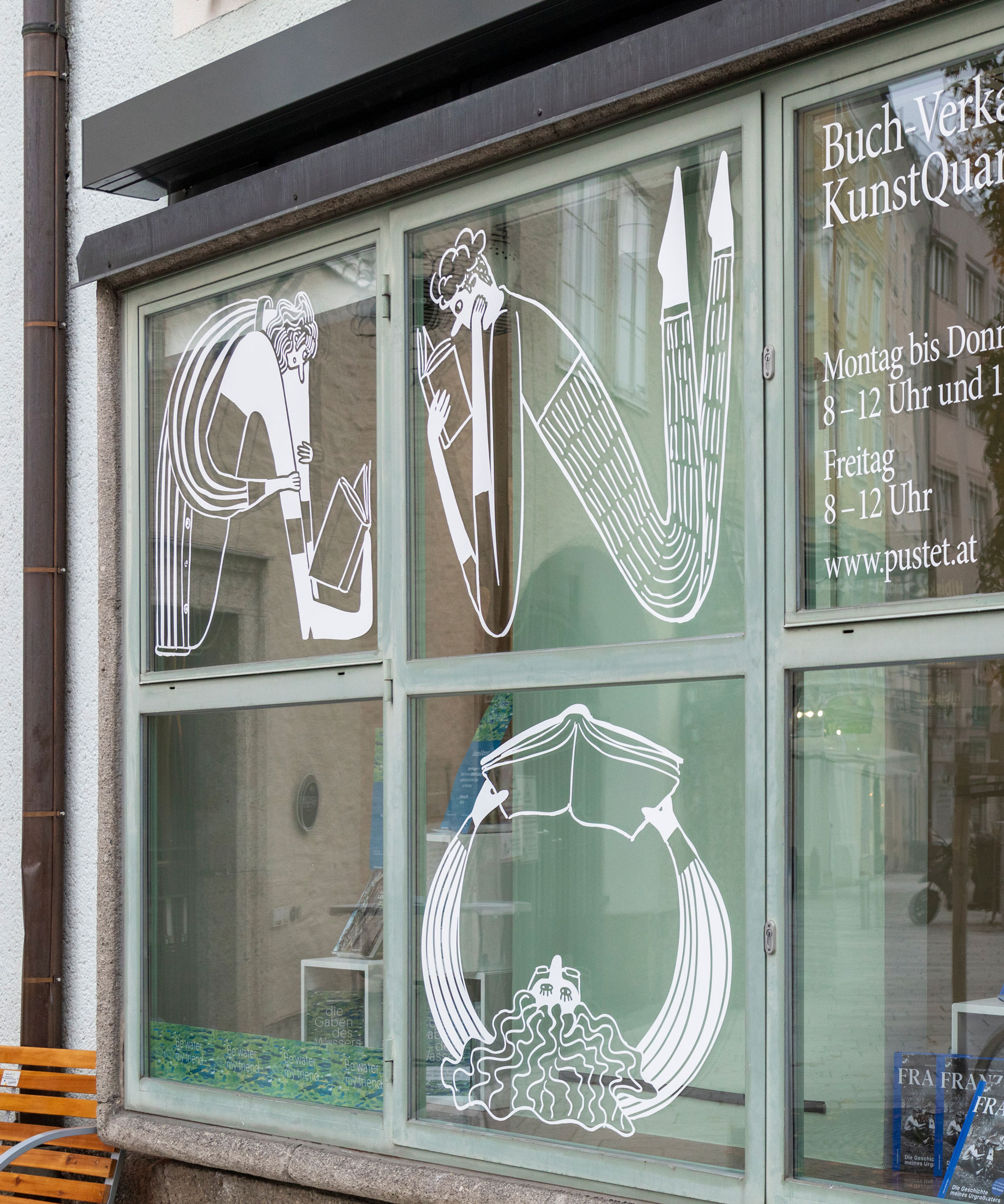
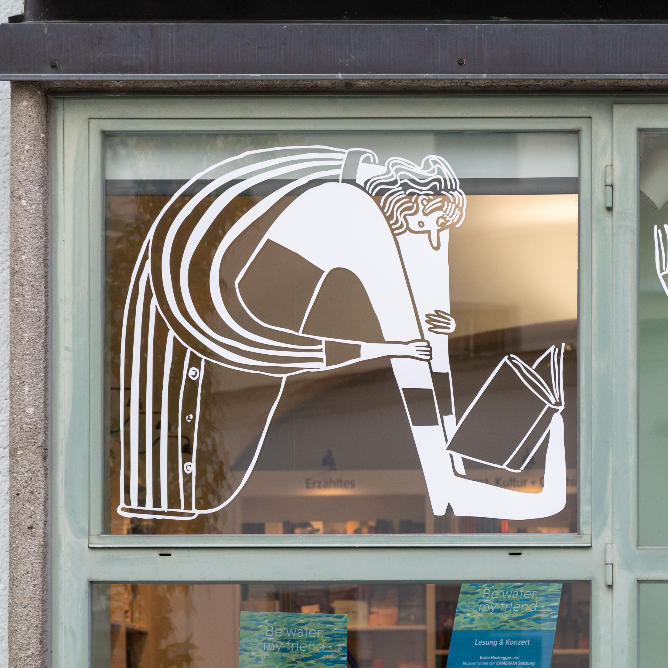
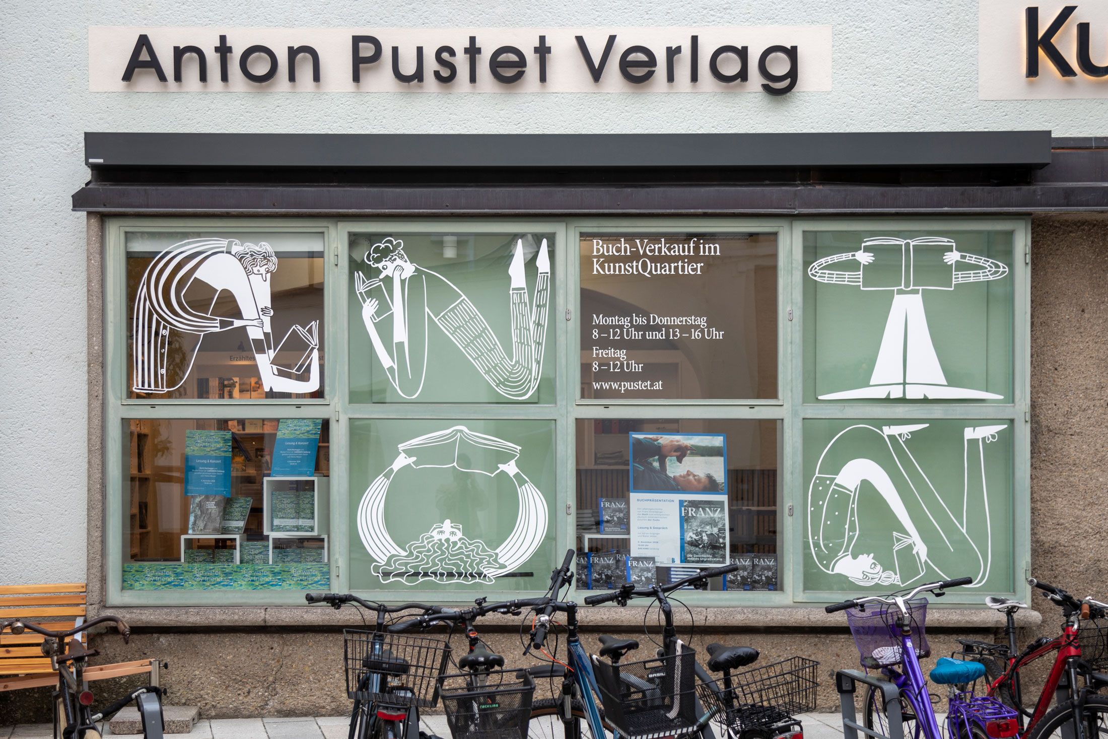
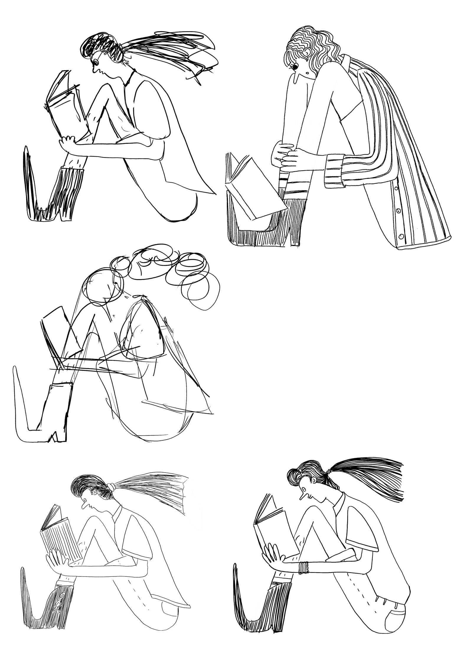
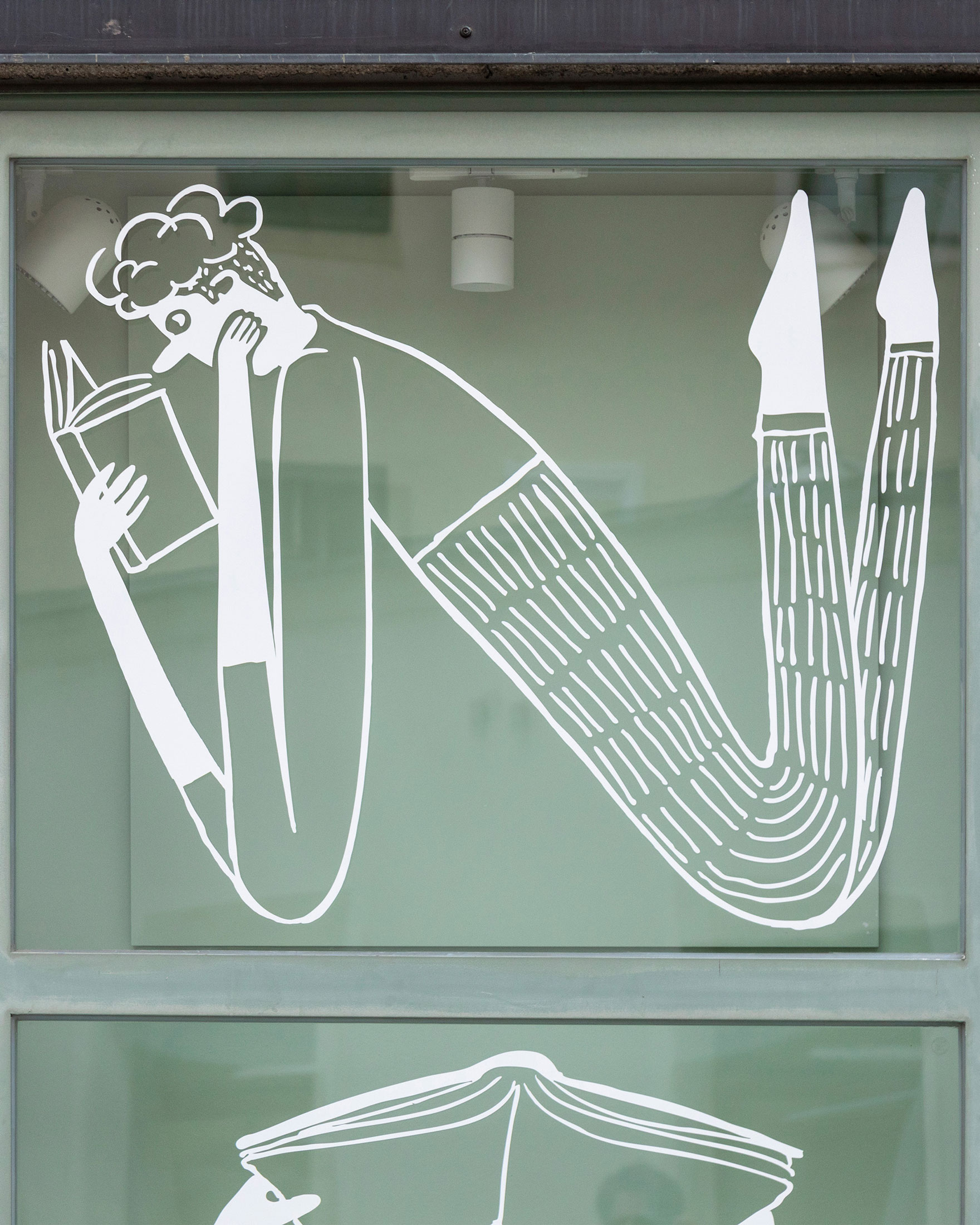
The large window display area was redesigned to appear more modern and distinctive, thereby attracting more attention and foot traffic. The concept is based on illustrations that humorously depict the reading habits of Anton Pustet Publishing's customers. Various reading positions form the letters of the word "ANTON."
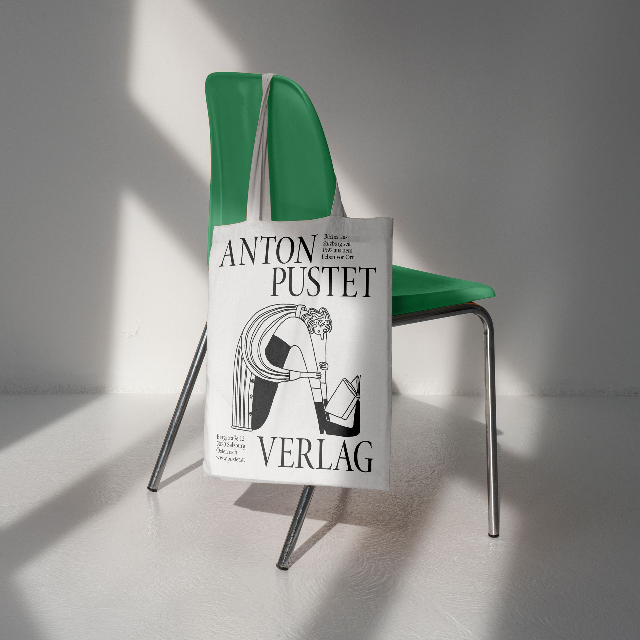
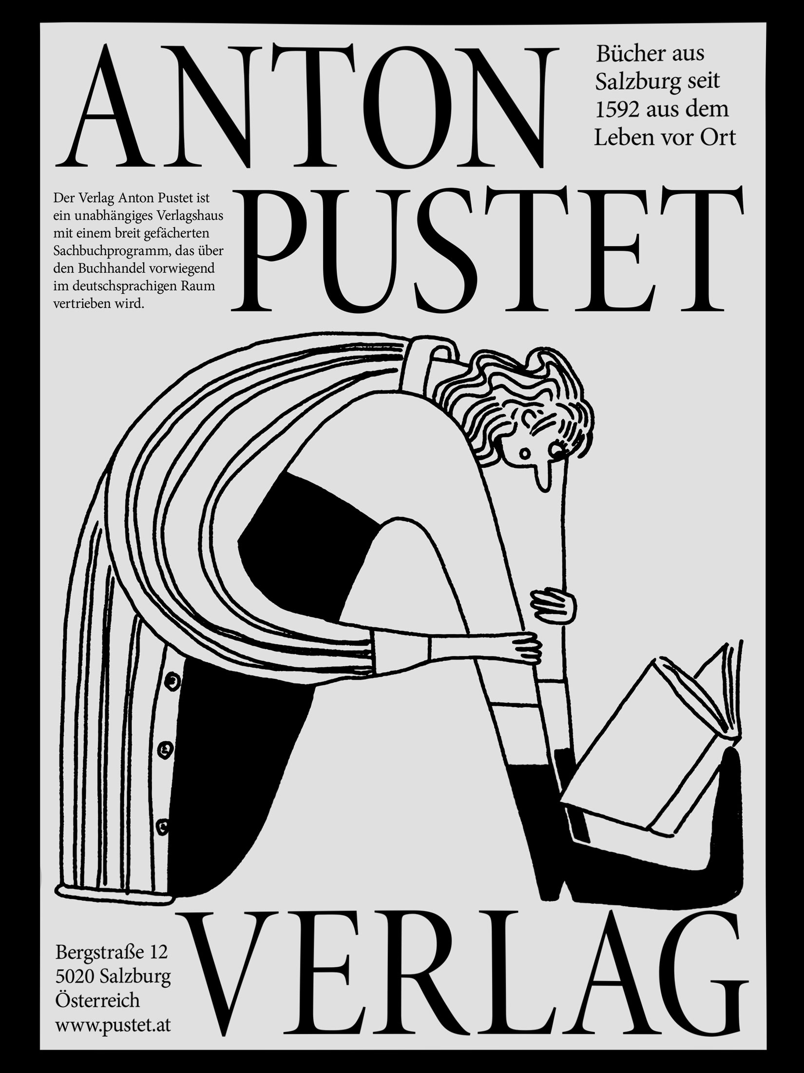
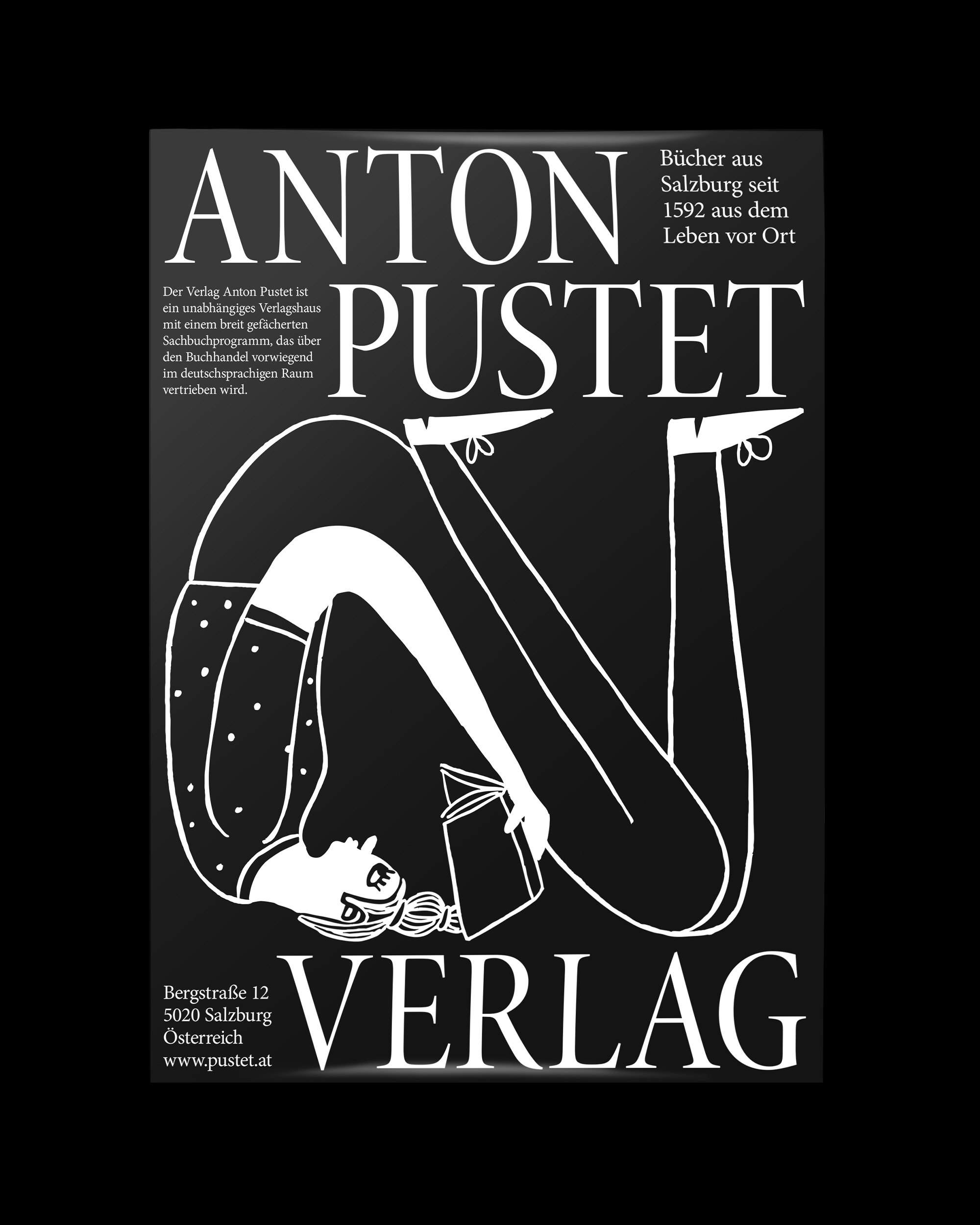
The illustrations are not only used in the window display but are also utilized across various other media as part of the overarching communication strategy.
The goal was to make the Anton Pustet bookstore more visible and modern in order to reach a broader, younger audience while communicating the publisher's core values of tradition, quality, and culture. This led to the idea of dedicating the window display to Anton Pustet's customers. Humorous illustrations show them in various reading positions that form the letters "ANTON"—a playful, memorable visual identity that customers can identify with. The design was launched during the Salzburg Literature Days and is conceived to be flexibly expandable and adaptable to other media.

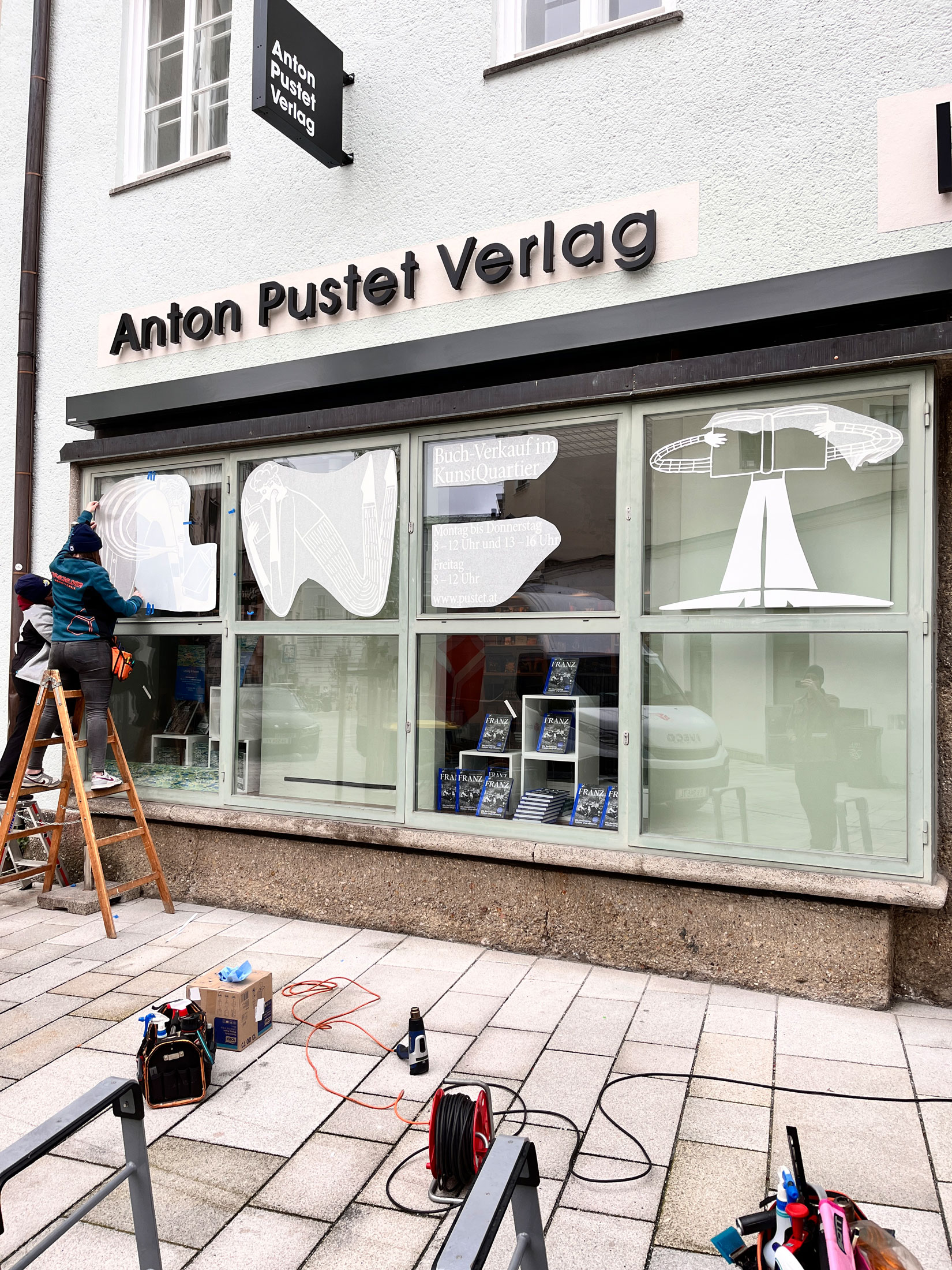
The large window display area was redesigned to appear more modern and distinctive, thereby attracting more attention and foot traffic. The concept is based on illustrations that humorously depict the reading habits of Anton Pustet Publishing's customers. Various reading positions form the letters of the word "ANTON."
The illustrations are not only used in the window display but are also utilized across various other media as part of the overarching communication strategy.
The goal was to make the Anton Pustet bookstore more visible and modern in order to reach a broader, younger audience while communicating the publisher's core values of tradition, quality, and culture. This led to the idea of dedicating the window display to Anton Pustet's customers. Humorous illustrations show them in various reading positions that form the letters "ANTON"—a playful, memorable visual identity that customers can identify with. The design was launched during the Salzburg Literature Days and is conceived to be flexibly expandable and adaptable to other media.