Sanctuary
Finest Travel Design
Brand Strategy, Branding, Graphic Design, Editorial Design
Sanctuary stands for exclusive, bespoke travel experiences perfectly tailored to individual desires. From the initial consultation to meticulous planning, we create unique journeys across the globe.
2025

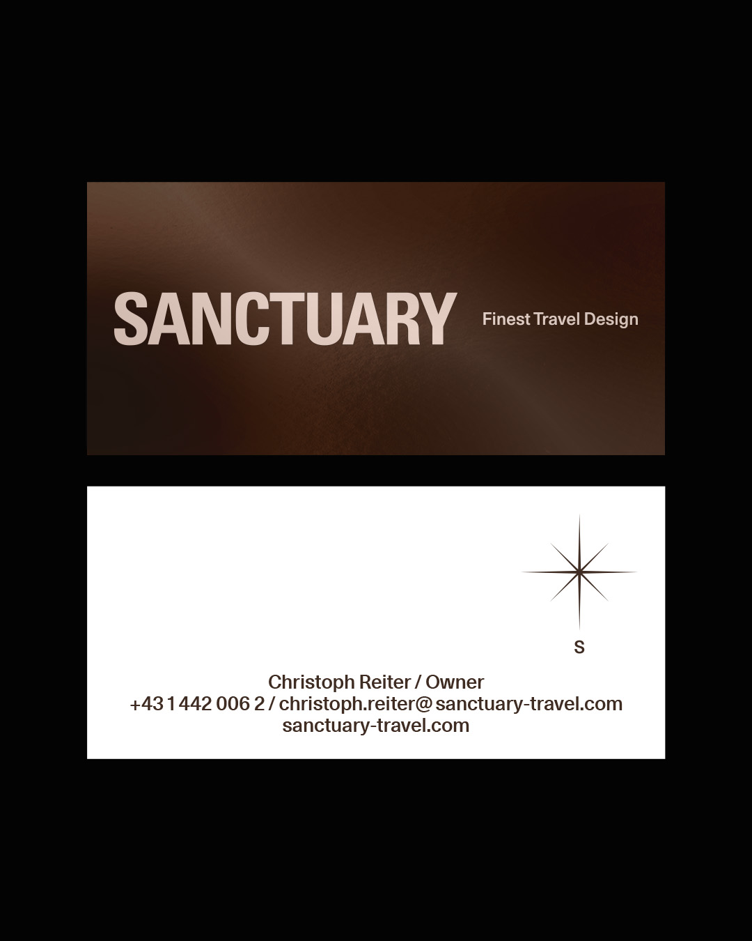
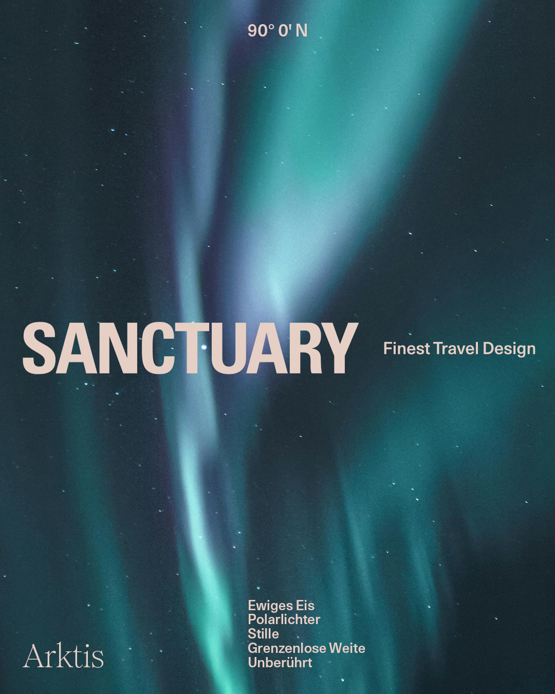
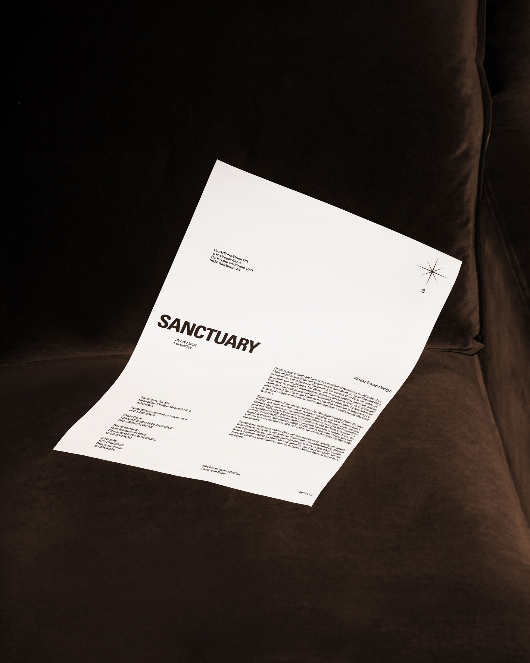
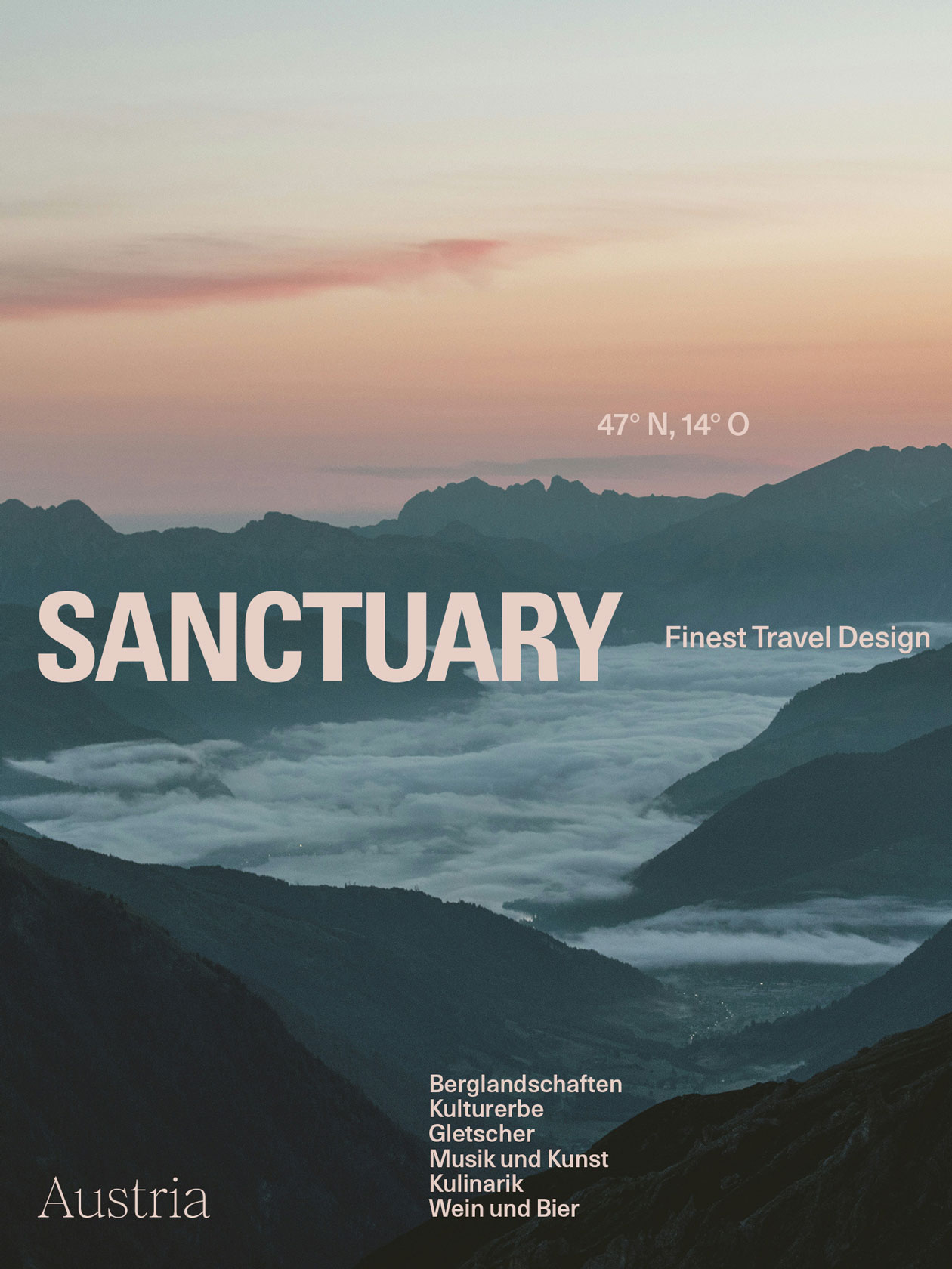
The logo, inspired by a compass, symbolizes adventure and discovery. Unlike a traditional compass, the needle points south—represented by an "S" that stands for both South and Sanctuary, opening up new perspectives. Complementing this, the design plays with the concept of geographic coordinates: these are positioned on each application exactly where the locations would be on a world map, encouraging you to explore new destinations.
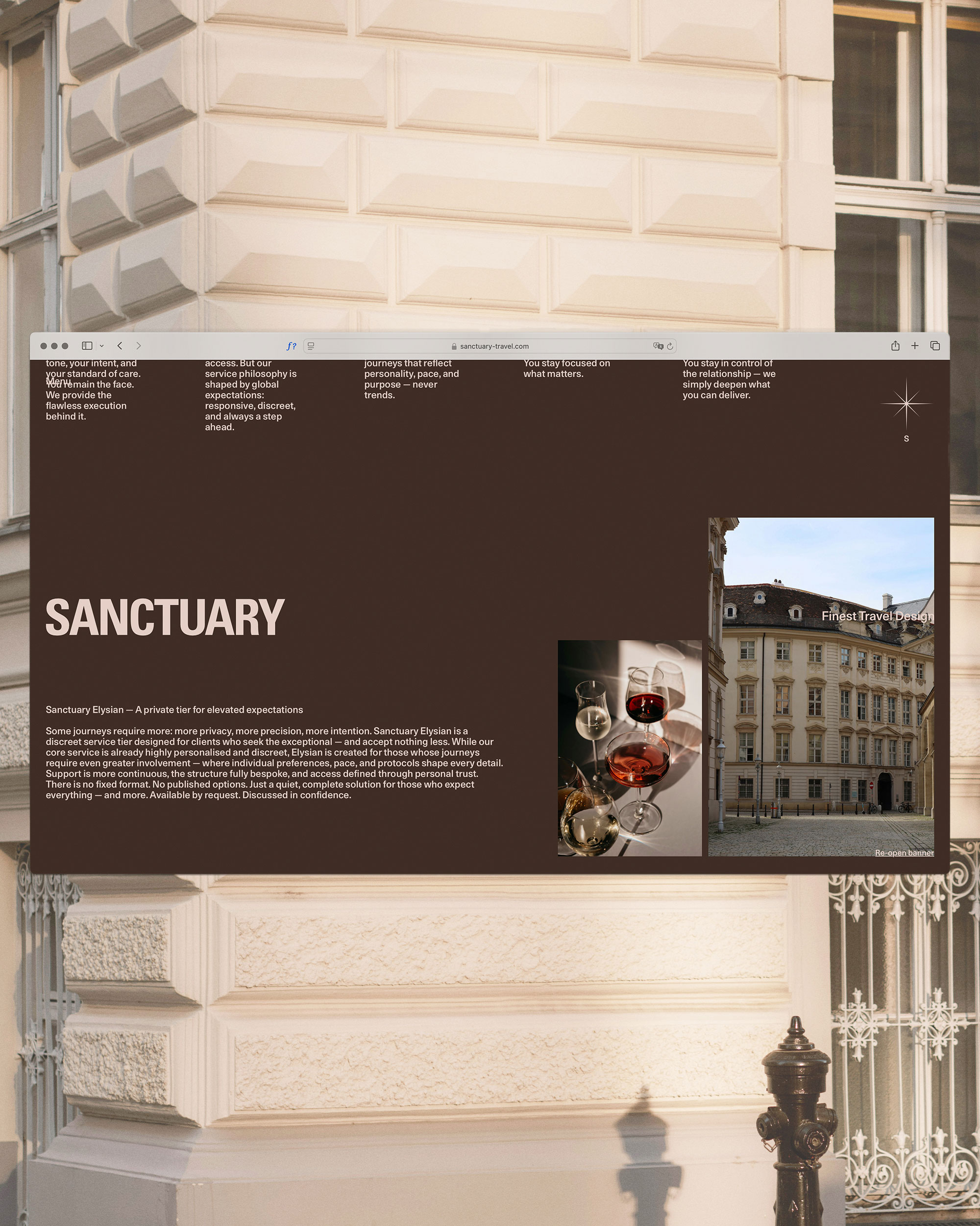
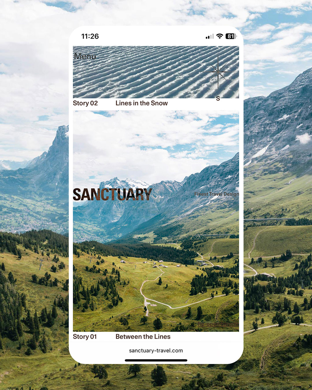
With a clear, elegant corporate identity, Sanctuary embodies the essence of travel: discovering new places, freedom, and unforgettable moments.

Mehr Inspiration